Introducing Search Results Sorting (business feature)

One of the features in PBworks that customers love the most is the search.  We’ve continued to improve it over the years, adding the ability to search within files, and more recently, adding search facets so that you can filter results by things like file type, or who last edited an item.

Yesterday night, we launched our latest search enhancement, the ability to sort your search results.

You can sort search results in one of three ways:

  1. Relevance: This is how the search currently works, and is the default
  2. Name: This alphabetizes the search results (numbers come before letters; blank spaces come in front of numbers)
  3. Date: This lets you bring the most recent search results to the top, while pushing the earliest results to the bottom. This is especially handy for finding something you were working on recently, but was getting lost in other search results.

Search results sorting works with search faceting, so you can sort results after filtering, or vice versa.

Check it out, and let us know what you think!

Search results sorting is now active on all business packages.

Introducing the New Legal Hub

For the past few years, law firms of all sizes, ranging from solo practitioners to AmLaw 100 members have used PBworks Legal Hub for internal, client, and partner collaboration.  Legal Hub gave law firms all of PBworks’ standard collaboration tools (wikis, file sharing, project management, social software) with the additional legal functionality of server-side encryption and a complete audit trail to ensure the privacy and security of confidential information.

Now we’re adding new legal-specific functionality to help litigators by providing online case binders.  As litigators prepare for their courtroom appearances, they can use Legal Hub to store and coordinate all the key documents and filings, including motions, pleadings, and expert witness testimony:

Legal Hub even applies Optical Character Recognition (OCR) technology to uploaded images of court documents, indexing these previously unsearchable files and making them part of Legal Hub’s search engine.

If you’re at the ILTA conference this week, contact our sales team at sales@pbworks.com, and we’ll be happy to arrange an in-person demo.  You can read the full press release here.

Introducing PBworks Gallery View

One of the major benefits of PBworks is how it serves as a central hub for all your work.  Whatever the nature of your work product, be it text on a wiki page, a spreadsheet of financials, or an important presentation, PBworks gives you a secure way to collaborate and share that content.  Now we’re making PBworks even more powerful for working with photos, images, and other files.

The new PBworks Gallery View will let your users browse the pages and files of a workspace in a whole new way, replacing a flat list of files with a tiled gallery option.  If you like working with lists, don’t worry–you can toggle between Gallery View and the standard pages and files interface.  Each one of your users can choose their preferred view, and switch between the views whenever they want.

You’ll still be able to use all the great PBworks features you’re used to, including custom security, easy sharing, sorting files by name, type, or last revision date, drag-and-drop movement of files, bulk operations, and more.  Gallery View is simply an additional way to view the contents of a workspace folder, similar to the options in your computer’s operating system.

We’re also replacing the current “More” menu (which currently appears when you hover over a page or file) with a preview card.  Not only is this preview card more aesthetically pleasing and elegant, it’s also functional.  The preview card will make actions and meta-information (such as access to prior revisions) available about the page, file, or folder much easier to understand and use.

Finally, we’ve added a new Gallery plugin, which will be available in the editor.  The Gallery plugin lets you embed the visual power of Gallery View on any wiki page.  When you’re editing a wiki page, go to Insert > More Plugins… > Page Information > Folder Contents.  Choose “Gallery View” for the display format, and we’ll display all the files in that folder as a single scrollable strip of Gallery images.

Whether you’re a graphic designer, creative director, or just someone with a refined sense of aesthetics, if you have a collection of Powerpoint Presentations, images, or PDFs to share, the Gallery plugin will allow you to create a much more dynamic and visually appealing page for that, rather than simply linking to a folder or adding a list of files.

We will be launching the new PBworks Gallery view, along with the new preview card and Gallery plugin on the evening of Monday, August 13.  You can direct your users to https://docs.pbworks.com/Gallery-View for more details, and a preview of what the new options will look like when available.  We’ve got plenty more enhancements in store for you in the next few months, so stay tuned!

Introducing “Recent Items” in the Livebar

One of the features in PBworks’ business product that comes in handy for me is the “Recent Activity” section of the Dashboard.  Not only does this provide a list of everyone’s recent edits, uploads, updates, and comments, it also provides a quick shortcut to the wiki pages, files, and workspaces I’ve recently visited.

Under the headings “Recent Workspaces,” “Recent Pages,” and “Recent Uploads,” the Recent Items feature allows me to quickly return to whatever I was just working on.

Think of it as the “Last Channel” feature on your TV remote–one of the buttons I use most often in my daily life.

We’ve realized, however, that it’s inconvenient to house “Recent Items” on the “Recent Activity” section of the Dashboard.  While this information makes sense in the context of recent activity, it doesn’t make sense to force our users to go back to the Dashboard whenever they need to return to a recently visited item.  It’s especially annoying if, like me, you already use the Dashboard to keep track or your tasks, or for status updates.

Fortunately, PBworks already has a solution for this issue.  The Livebar, which sits at the top of the screen, already provides a shortcut to My Tasks, and My Starred Items.  Now we’re adding a shortcut to “Recent Items.”

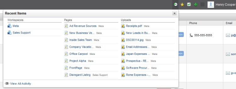
This means that from any screen, you can access your recently viewed items and navigate to them. Here’s how it looks:

"Recent Items" in the Livebar

The new “Recent Items” shortcut in the LiveBar lets you see up to your eight most recently viewed workspaces or wiki pages, as well as your eight most recently uploaded files.  You can hover over any item to see a preview, and click on any item to navigate there.

And just as with the Tasks and Starred Items links in the Livebar, you can click “View All Activity” to navigate to the corresponding page in the Dashboard.

For more details, visit our User Manual.

Introducing “Copy File”

We’ve just introduced a small but useful new feature in our business products.  Previously, we gave you the ability to make a copy of a wiki page.  This allowed you to do things like use a copy of your previous week’s meeting agenda as the basis for this week’s meeting.

Now, we’ve extended this to files.

To copy a file, simply click on “File Options” and select “Copy File.”  You’ll be asked to select a new name for the file (by default, it’s simply “Copy of <filename>”).

Once the file has been copied, you can always rename it or even move it to another workspace.

User Interface Updates Starting May 29

It’s been right around a year since our last big user interface update.  When we made that change, our goal was to provide a more unified and screen-efficient experience to place the emphasis where it belongs: on your content, files, and tasks

Over the past few months, we’ve been working on pushing that key principle even further.  We’ve tested the current user experience with live users, and identified the places where our user experience can improve.  Over the next two weeks, we’ll be releasing a major user interface update that will improve consistency, reduce visual clutter, and make nearly every screen more usable and efficient.  Here’s some of the things you’ll be seeing:

Tuesday, May 29
1) Improved Everyone and People

Features like creating user groups and filtering users based on user profile fields have proven popular.  But as you’ve noticed if you’ve added a large number of user groups or profile filters, the original Everyone design didn’t scale well–you ended up with a very tall right hand column of filtering choices.

The new Everyone tab puts your filtering choices in a scrollable dropdown box.  You can also autocomplete your filtering criteria for even greater speed.  Now, you can create as many user groups as you want without affecting usability.

This same type of filtering capability will apply to all “lists” across the product over time — whether they’re lists of people, tasks, files, or workspaces.  This unified filtering will move to the left side of the screen across all lists, making them consistent with our search results filtering.  Coupled with some other changes in the right panel (see below), this will move us toward a less cluttered interface.

Finally, the Everyone list will change from a “paginated” interface (showing a few people at a time, with Next and Previous page navigation) to an infinite scroll list.  You can use the mouse and up/down arrows to smoothly scroll up and down in the list of people, and the scroll bar to jump to a particular part of the list.  This will dramatically reduce the work required to navigate lists of more than a couple of dozen users.  As with the filtering changes, this infinite scroll capability will find its way into all lists across the system over time.

2) Improved User Card

We’ve also overhauled the User Card, which is the user information box that pops up when you click on a user’s name.  The new User Card provides more information, and appears in more places, making it even easier to connect with your teammates.

Coming soon:
3) Revised Network Header and Live Bar

The Network Header is the top-level navigation that appears on every screen.  Meanwhile, the Live Bar is the widget in the lower right hand corner that appears on every screen.  Given the common thread, we decided to reorganize the two user interface elements to be more intuitive.

The revised Network Header will include some of the key shortcuts from the old Live Bar, such as Notifications, My Starred Items, and My Tasks.  Since these are personalized to each user, it made sense to move them next to the user’s name and account settings.  Meanwhile, Chat and Voice Conferencing will remain in a slimmed-down Live Bar.  This way, Network Administrators who don’t want chat or voice on their network will be able to disable them and eliminate the Live Bar entirely.

4) Universal Action Button

You’ve almost certainly used an action button at some point; you can find one on wiki pages (“Create Page”), while browsing files (“Upload File”), while working with tasks (“Create Task”), and on the People page (“Invite People”).  What we realized is that it’s redundant to have a single action button for the most common action, and then a completely different set of action links below that button for other actions (e.g. “Rename Page,” “Move Page,” etc.).  Showing all those options on every page cluttered the interface, and wasn’t necessary during the vast majority of page visits where someone simply wanted to view a page or file, rather than edit or revise it.

The new green Universal Action Button will appear on our main screens, like Workspaces and Everyone at the network level, and Pages, Files, Tasks, and People at the workspace level.  Clicking on it will bring up a list of possible actions (in order of importance).  If you want to work with a page, file, or task, there will be a single button that lets you do everything.

We will be launching the new Everyone and People screens, along with the new User Card on the evening of Tuesday, March 29.  You can direct your users to https://docs.pbworks.com/w/page/53989508/Finding%20People for more details.  We’ll be following up with the Revised Network Header and Live Bar and the Universal Action button the following week.  We hope these interface improvements will make it easier to use PBworks to get your team’s work done.

30 Minute Maintenance Window, Midnight Pacific Time, Saturday May 19

On the morning of Saturday, May 19, PBworks will be down for maintenance from midnight to 12:30 AM Pacific Time (3 AM Eastern/7 AM UTC/8 AM BST).  During this time, the PBworks service will be offline; you won’t be able to log in, nor will you be able to access your site.

During these 30 minutes, we’ll be upgrading our infrastructure to better support our customers.  We’ve tried to select a time when as few people as possible will be impacted.  Once the maintenance is complete, you will be able to return to using the service as you normally do.

Thanks for being a PBworks user, and for your patience throughout this process.

Improved “Create Page” and User Profile Experience

Not every change we make at PBworks is a big one.  Sometimes, we just want to make incremental improvements.

This week, we release two enhancements that improve the overall polish and experience of the business product.

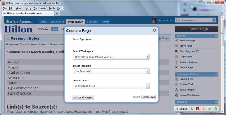
First, we improved the “Create Page” experience.  Previously, clicking the “Create Page” button brought you to a separate web page.  Now, clicking “Create Page” brings up a standard dialogue box.  We’ve also given you much more control over the page creation process.  Previously, if you wanted to create a wiki page in a particular folder, you had to navigate to the folder before initiating the page create.  Now, you can select the folder during the creation process.  In fact, you can even select the workspace in which the page will reside (though we will default you to the current workspace and folder).

Here’s a look at the new “Create Page”:

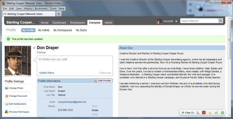
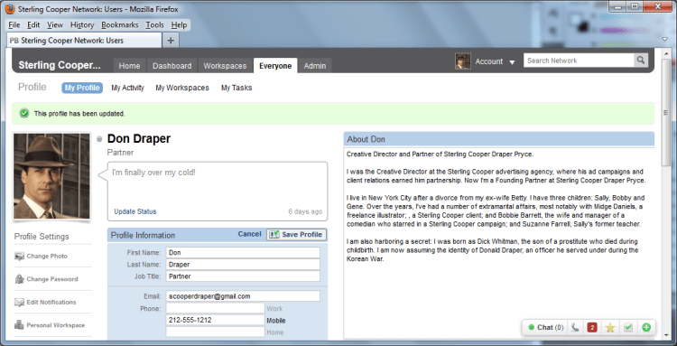
Second, we’ve improved User Profiles.  Our usability testing showed that many new users had trouble figuring out how to edit their user profile.  This wasn’t their fault; all the user profile actions were linked to from a dull block of identical-looking grey buttons.  Even if they found the “Edit Profile” button, finding the nearly identical “Save Profile” button was a usability nightmare.

Our improved user profile adds much more visual distinction between the different actions, and makes it very clear how to edit and save your profile.

Here’s the basic view:

And here’s the view after you click “Edit Profile”:

Watch for more such improvements in the months to come!

Phasing Out the 30Boxes Plugin (June 30, 2012)

30Boxes was one of the first plugins we added to PBworks back when the service was still called PBwiki.  This simple calendaring application let our users add a shared calendar to any workspace, and to have that calendar show up on multiple pages.  And while 30Boxes has never been used by most of our users, it has a loyal following.

Unfortunately, 30Boxes has become an “orphan” product.  Its creators have moved on to other projects, and last week, the entire service suffered a 1-day outage.  While service has since been restored, it seems clear that without future investment of resources, it is likely 30Boxes will become less viable.

While we could simply keep 30Boxes as a plugin and simply offer it on an “as is” basis, we don’t feel that this is good for our user experience.  Therefore, we have decided to phase out the 30Boxes plugin.

The first step, which we have already undertaken, is to disable new insertions of the 30Boxes plugin.  We cannot in good conscience allow people to add a service we fear will not be reliable in the future.

The next step, which will take place on June 30, will be the disabling of the 30Boxes plugin.  After that, existing insertions will stop working as well.

We’ve chosen a date more than 90 days in the future to give our users plenty of time to seek alternatives.  This may involve using our HTML/JavaScript plugin to insert the calendaring service of their choice, or using other features within PBworks as an alternative.

For Business users, here is the relevant HTML/JavaScript documentation.  And here is the equivalent HTML/JavaScript documentation for our Personal and Education users.

UPDATE:

It sounds like 30boxes is a key part of many of your wikis.  As a result, we’ve come up with a compromise solution that will lessen our exposure to any potential 30boxes shutdown, while allowing you to continue using the product.

On July 1, while we will no longer support the embedding of the 30boxes calendar, any existing embeds will link to the same calendar on the 30boxes.com website.  This way, you can maintain access to 30boxes if you wish to continue using the product despite the warning signs, but we can prevent a 30boxes outage from affecting the wiki pages on which they’ve been embedded.

New and Improved Tagging

After we redesigned the PBworks business products, we realized that tagging didn’t really fit well with the other page or file actions (rename, move, control access).  All of the other actions were links that led to the appropriate dialogue box; in contrast, the tagging interface displayed a list of tabs, and allowed you to edit them.  Both these differences (tags are displayed as page or file properties, tags are editable on the page itself) made tagging an inconsistent part of the user interface.

Therefore, we’ve improved the tagging interface by making it both more consistent and easier to use.  Tags now appear between the content and the comments:

This placement puts the tags next to their closest relatives, the comments.  We’ve also improved the tagging interface.  Now, rather than relying on commas to delineate your tags, you can add them (and remove them) one by one.

For more details on how to work with the new tagging interface, visit our user manual.